
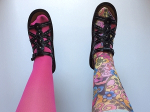
My new tattoos
A friend introduced me to the Gold Violin catalog and I ordered these support stockings.
Whenever I wear the patterned pair, people are fascinated with my “tattoos”! I like this painless method of getting ink.
My new tattoos
A friend introduced me to the Gold Violin catalog and I ordered these support stockings.
Whenever I wear the patterned pair, people are fascinated with my “tattoos”! I like this painless method of getting ink.
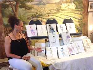
One of our models admiring our artwork
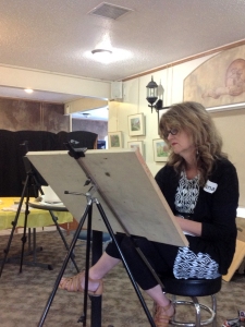
Diana painting from a model
In July’s figure drawing workshop at Summerset Winery, our models posed for about 20 minutes at a time while we sketched and painted. It’s not easy being a model — you have to be in good shape to hold a pose that long! They were positioned to show the slight S-curve of the body, for the figures to seem animated in the artwork.
We began by finding the shadows to create form. The models were well lighted so we could follow the flow of shadow. I talked about proportion using a little paper “head” as a measuring tool to find the figure’s height and the length of the arms and legs. After students figured out the proportions it was much easier to draw how the body goes together.

Using a paper “head”
as a measuring tool
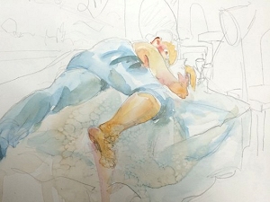
Watercolor sketch of a “sleeping” pose.
Even foreshortening becomes easier
by knowing the proportions.
(click image to download PDF newsletter)

Moving from one studio space to another, I rediscovered this painting with colors befitting the holiday. “Winter Walk” is a big painting from when I had a big studio. Two small, faint figures walk by the evergreens, going over the hill; creation is immense and we are small, yet we are all a part of it.
For Independence Day I think of the red foreground as experiencing the freedom to walk in our forests and the opportunity to find peace. The dark trees tell us to not forget those who do not have the same freedom, but to walk toward the light of justice for all by sharing our wealth, time and talents.
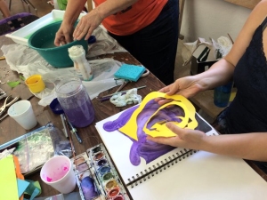
Spirals that have messages and open in the journal

Homes across the street from the studio in Amana
Last week I led an art journaling workshop in lovely Amana, Iowa, part of the Art Iowa Workshops offered every year by the Amana Arts Guild in cooperation with Grant Wood AEA. The class had 20 very busy students working toward teacher re-certification or on a master’s program. I blew up photos of the class members to use as puppets, which turn up in many of the photos. We used different media, styles and forms of expression in constructing journals and using them for exercises in art technique, free writing and perception. I’ll share more photos of their work in an upcoming newsletter.

Fun times with teachers at the Amana Arts Guild.
Having fun is part of being creative!

Demonstrating cool dominance (in progress and completed)
To hold a painting together visually, we choose 2 cool colors (blues, purples, greens) and 1 warm color (yellows, reds, oranges) for cool color dominance, or 2 warm and 1 cool for warm color dominance. Echoing the colors pulls the painting together.
Above, the cool dominance is the blues, blue purple, etc. Below, the same outbuilding and chickens using orange, yellow ochre, and a cool blue to demonstrate warm dominance. I mix my colors right on the paper.

Demonstrating warm dominance (in progress and completed)

Our banner-making session at the Scheman Center
Here I’m shown at YSS’s Risky Business Conference in Ames, facilitating a group of young people making banners to create awareness about human trafficking. We drew and painted colorful symbols on banners to be carried in demonstrations and parades or hung on walls.
Human trafficking, a modern form of slavery, is the fastest-growing criminal industry in the world (source: UNHCR, the UN Refugee Agency) and has been reported in all 50 states of the United States (source: National Human Trafficking Hotline). The root causes include the demand for prostitution and pornography, wide-spread poverty and homelessness, demand for cheap labor, gender discrimination, economic and social underdevelopment and abuse of power through control and exploitation.
In addition to the resources of the Polaris Project, I’ve been learning more about trafficking through the Franciscans, through United Action for Youth, even through Wheatsfield’s Fair Trade program. It’s inspiring to see young people working to raise awareness of what Pope Francis has called “an open wound on the body of contemporary society, a scourge upon the body of Christ.”
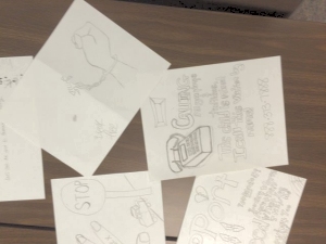
Some preliminary sketches
before we started the banners
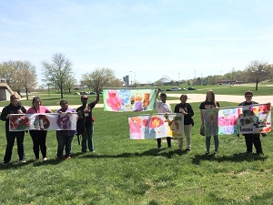
Banners ready for raising
awareness of trafficking
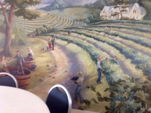
Murals on the walls at Summerset Winery
celebrate the seasons of the vineyard.
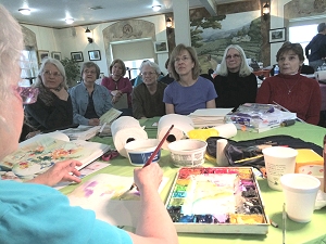
Class members using the overhead mirror to watch me paint. (Photo courtesy of Dianne Liepa)
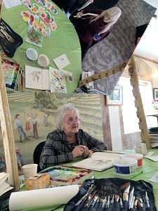
Using (and trying not to bump) my new demonstration mirror. I used my technique of painting on plastic to show color dominance and values.
(Photo courtesy of Dianne Liepa)
We had a wonderful turnout for last week’s workshop at Summerset Winery, 17 students, strong painters. “Watercolor Sketches and Beyond” emphasized drawing and composing in our journals to start with. Each student received a journal with worksheets that they could follow along. The focus was on composition and planning, finding story, mood and sense of place before starting to paint — like a road map, so people can enjoy the painting experience, not having to fix as much.
I designed my new overhead demonstration mirror just before the workshop so that this size of group could watch me paint. The mirror is Plexiglas reinforced with wood slats, held up for the time being with a fence post and tape! It’s portable and fits into my car. I just need to make it taller so I can stand under it and work.
We had a rainy day at the winery so we painted a still life with flowers and wine by the window overlooking the vineyard. You could just feel the earth ready to pop out the buds on the grape vines.
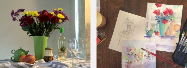
Still life for a rainy day. with a favorite white wine. We observed the cylinders on perspective from standing above and at eye level; flowers, glasses, buildings and bottles have form disclosed by light and shadow.
(Photo at left courtesy of Dianne Liepa, and that’s her watercolor “in progress” at far right)
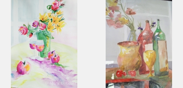
Students’ watercolors from the workshop. We were working with perspective, balance and proportion. I talked about Mary’s good composition and depth (at left), and “following the whites” in Katharine’s work (at right).

The three Florida scenes
Right: Besides the card-catalog easel for large paintings, other “easels” get into the act for rotating, editing, and refining (sofa easel, print rack easel…).
Below: The color of the Florida ocean, dipping my toes in pretend water. It was a motivation, I could just hear the gentle waves.
Below right: Painting the people on the beach and street, I had to imagine the muscles, clothing and movement in the figures. I hope to help my students put figures in their scenes with confidence.

Thinking of blue water

On the beach

Living room with card-catalog easel

Closer view of the card catalog
For large watercolors, like 32″ x 40″, I needed to create an easel large enough to accommodate large papers and still movable so as to be able to rotate and lay flat. Voilà — the ISU library card catalog I purchased at the salvage barn in Ames over 35 years ago that I have moved four times (to the chagrin of my son Devin). I still have good lighting and can work at the drafting table (with bust of David watching) on smaller paintings.
The large watercolors I’ve been working on are of Florida, so have been a relief to paint during the winter weather! There will be three of them total to cover a 12-foot space when framed.

Ocean Drive

On the dock in South Beach


You must be logged in to post a comment.